
Sunday, March 31, 2013
ear on arm
Wednesday, March 27, 2013
Jug Self Portrait

The Conversation
Murnau Street by Wassily Kandinsky
Wassily Wassilyevich Kandinsky was a Russian painter, and art theorist. He is credited with painting the first modern abstract works. He started painting studies (life-drawing, sketching and anatomy) at the age of 30.
In 1896 he settled in Munich and studied at the Academy of Fine Arts. He went back to Moscow in 1914 after World War I started. He was unsympathetic to the official theories on art in Moscow and returned to Germany in 1921. There he taught at the Bauhaus school of art and architecture until the Nazis closed it in 1933. He then moved to France and became a French citizen.

Outdoor Cafe

I chose Outdoor Cafe by van Gogh because I saw similarities in this painting from another one of his paintings, Starry Night. The sky looks swirled here, just as it does in his other painting. I like this painting because the yellow is so vibrant it is almost glowing. The cafe is the glowing aspect of this picture, and it highlights people enjoying the scenery and others' company.
Darktown Rebellion by Kara Walker

Lost in Translation
keith haring

The Empire of Lights

The Empire of Lights is a painting done by Rene
Magritte. It was completed in 1934. The medium is oil on canvas. The painting is 4’11 1/2” by 3’8 7/8”. I like this painting because it shows both
day and night in the same image. The sky
is painted as if it is during daylight and the house and trees are painted as
if it is during nighttime. It gives
the painting nice contrast. The
reflection in the water also adds to the painting.
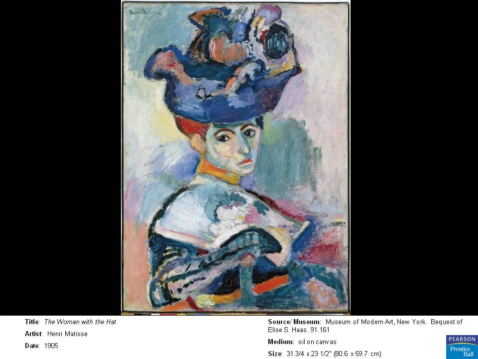
The Yellow Dress- Henri Matisse

This piece is named "The Yellow Dress" by Henri Matisse. It is an oil on canvas, and can be found at the Baltimore Museum of Art. The beautiful colors were created with watercolor on a thin medium to make it radiantly transparent. I truly love how beautiful the dress is and how elegantly she is sitting there.
Small Forest by Paul Cezanne

Lost in Translation
Mao 6 -Andy warhol

This peice by and warhol was created with silkscreen and acrylic on canvas. I love this peice because it is just so simple and straight forward. Allthough I cant stand Mao, I always liked the way andy warhol portrayed his peices, leaving a mark on his style to share with the entire world. This is a great peice because of the contrast of hot and cool colors in which warhol used to create this painting.
Kokoschka, Dresden:The New City

I love the coloring in this painting, the juxtaposition of the warm color yellow against the cool colors of blue and green. It's such a soft contrast, but still very evident. Also, the painting itself seems very emotional.
The Card Players - Paul Cezanne

I love this piece because it reminds me of my Abuelito who used to play cards when I was younger. I love how they colors blend in nicely. I like their hats in particular they are both unique. It's currently displayed in my favorite museum the Musee d'Orsay in Paris, France. It's part of a series of paintings. This is the most commonly known and the smallest version out of the 5 paintings. It's said that he eliminated details in the background to add to the effect of these two solo players just enjoying a relaxing game of cards rather than with spectators which makes it more intense.
L.H.O.O.Q. Marcel Duchamp

Merz 94 Grunflec

Pulp Fiction
Tuesday, March 26, 2013
The Hailstorm by Benton

*The Conversation
Lower Manhattan by John Marin

This peace of art is a water color and charcoal drawing with paper cut-out attached with thread on paper of lower manhattan. This picture is in the Museum of Modern Art, New York. I really like how the artist used multiple mediums when designing this picture. Also when i first looked at this picture i wasn't sure what it was of until i read the title. I really like how abstract the picture is but describes how chaotic the city could be.
Pulp Fiction
Monday, March 25, 2013
Point of Tranquility

Point of Tranquility was created by Morris Louis in 1966. Its magma on canvas. I really enjoyed this painting because of the colors. There are so many colors in this painting and it gives a happy feel. Even though the colors are repeating it does not make the painting to much or too little. Its just right. Also how Morris Louis made the colors shapes made the painting look like fingers or a ballon when you stretch them. I just really enjoyed this painting while flipping through the book. The title does fit this, it is "tranquility" it gives you a sense of peace and happiness.
Wednesday, March 20, 2013
Dynamism of a Soccer Player

This is Dynamism of a Soccer Player by Umberto Boccioni 1913 Oil on Canvas. It stood out to me because the colors are so bright and it looked really interesting. Once I read the title I was able to see what it was meant to be. The way the colors are placed reminds me of the World Cup colors. It is fitting because if you are a huge soccer fan you can see the field, player and his movements. I really like it because I can actually see the moves as I look throughout the piece.
"Claudine At Rest" Jules Pascin

This is a painting by Jules Pascin called "Claudine At Rest", it is an oil on canvas, and was completed in 1923. Pascin developed a technique in which she used pale color washes in the painting. The pale color of the woman's skin gives an almost translucent effect. The mood set by the painting is somewhat erotic and melancholy. Pascin was known for his paintings of prostitutes which we assume the woman in the painting is by her appearance. I chose this painting because I think the colors are beautiful and I like how the colors of the woman are almost identical to the colors of the background. I also love how the facial expression of the woman allows the viewer to feel sympathy for her and feel her pain.
Tuesday, March 19, 2013
Black lines

Paul Cezanne A Turn In The Road

This is a oil painting on a canvas by Paul Cezanne called A Turn In The Road. He started this work in 1879 and ended in 1882. I picked this painting because the brush strokes were done really well. Even though there are a lot of the similar colors you can still tell what everything is. I liked the mystery in the name. It makes you want to know whats around the the turn in the road.
Jamie Reed
Monday, March 18, 2013
The Shooting Star by Jean-Francois Millet

This is the Shooting Star by Jean-Francois Millet. It is an oil on board painting that is 18.7 cm in height and 34.5 cm in width. I am accustom to paintings being made on canvas more often than anything else, so to see that this painting was made on a board instead was interesting. Also, I love how the people in the painting represent the shooting stars that the title is referring to. It was an unexpected twist in the painting. They look like they are peacefully falling through the night sky that is the midnight blue background. I also enjoy the gradual decrease in detail as your eye travels down the length of the peoples' bodies. This added to the illusion of them falling through the sky. Overall, I believe this a beautiful painting.
Thursday, March 14, 2013
Young Jewess at Ellis Island

Wednesday, March 13, 2013


Subscribe to:
Posts (Atom)